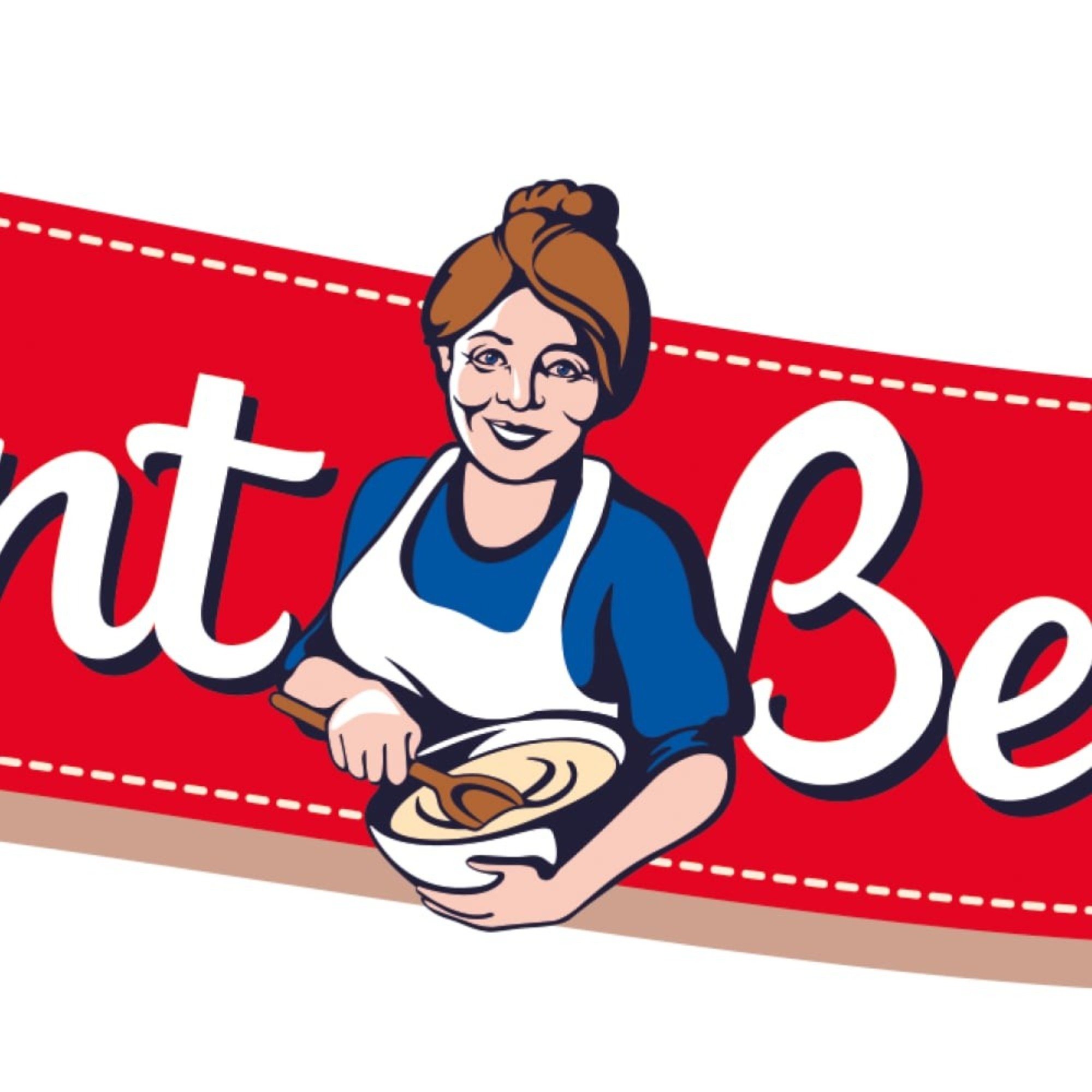
The Aunt Bessie's logo has been scrapped in favour of a more "contemporary" younger replacement.The Yorkshire pudding brand has replaced its old branding, which featured an older woman with her hair tied stirring a bowl of batter.Instead, a younger "open-armed Aunt Bessie" with a "more contemporary feel" will front the the firm's frozen foods.Announcing the change, the brand said while it was a "glow-up", but was the same Aunt Bessie "that families can trust". TRENDING Stories Videos Your Say Claire Hoyle, the head of marketing for Aunt Bessie's, said: "Aunt Bessie is a national treasure who has been part of the family for decades, so we thought it was about time she received the glow-up that she deserves."Her arms are wide open...
Læs hele artiklen hos kilden.


Kommentarer (0)
Ingen kommentarer ennå. Bli den første til å kommentere!